Google Public Data Explorer lets you create dynamic charts and maps
March 9, 2010
Google’s new Public Data Explorer makes large datasets easy to explore, visualize and communicate.
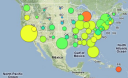
You can create dynamic, interactive mash-up line graphs, bar graphs, maps and bubble charts that can be embedded in Web pages.
The visualizations are dynamic, so you can watch them move over time, change topics, highlight different entries and change the scale.